Imran Chaudhri discusses how we can regain control over our devices–and how Apple can do better.
It’s been a decade since the British designer Imran Chaudhri first imagined a user interface that would introduce millions of people to the smartphone. Chaudhri joined Apple in 1995, soon rising to become the design director of the company’s human interfaces group–where he was one member of the six-person team that designed the iPhone.

The world has changed dramatically in the decade since. An estimated 2.5 billion smartphone users globally use their devices to connect to each other at lightning speeds today. And while the iPhone is still a groundbreaking invention and irreplaceable tool, its flaws have also come to light: It has ushered in a world of digital distraction, where the smartphone’s irresistibly addictive interface has steadily transformed the way we work, think, and live in general. Many of us are actively trying to use our phones less. Digital detox is a wellness trend. Overuse of smartphones can contribute to mental health problems. One of the iPhone’s other co-inventors, Tony Fadell, has decried the unintended consequences of its mass adoption.Chaudhri left Apple in 2017, after spending almost two decades designing interfaces for the iPod, iPad, Apple Watch, and Apple TV as well as the iPhone, to pursue a still-under-wraps company of his own. I recently sat down with him to talk about his time at Apple, and had the chance to ask him how he views his legacy now that the downsides of smartphones have come into focus. He cited the challenges of working as a designer at a giant corporation, where his personal ethics didn’t always align with decision-making, but also said something else: That he always knew, even when playing with the phone’s earliest prototypes, that one of its greatest flaws would be its capacity to distract and monopolize users’ attention spans–and that Apple purposely didn’t give users enough tools to maintain their control over the device.
Here are six lightly edited excerpts from our conversation.
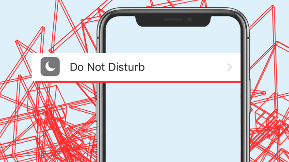
ON DESIGNING “DO NOT DISTURB”
“I think in some ways, many designers that really do understand their domain can foresee certain things being issues. And certainly, when we were working on the phone, I knew we were going to have some issues [with distracting notifications].
“Very early on, when we first started building prototypes of the phone, a couple of us were lucky enough to take them home… By using the phone and living with the phone, I had friends all over the world who were hitting me up all the time and the phone was pinging and the light was going on, so I realized for us to coexist with this phone, we needed to have something to act as a gatekeeper. Very early on, I designed what ultimately became Do Not Disturb.”
ON APPLE’S INTERNAL STRUGGLE OVER WHO CONTROLS YOUR DEVICE
“Inside, getting people to understand that [distraction] was going to be an issue was difficult. Steve [Jobs] understood it…internally though, I think there was always a struggle as to how much control do we want people to have over their devices. When I and a few other people were advocating for more control, that level of control was actually pushed back by marketing. We would hear things like, ‘you can’t do that because then the device will become uncool.’
“The controls exist for you. They’ve always been there and yet it’s incredibly hard to know how to use them and to manage them. You literally have to spend many days to go through and really understand what’s bombarding you and then turn those things off in a singular fashion. So for the people who understand the system really well, they can take advantage of it, but the people that don’t–the people that don’t even change their ringtone, who don’t even change their wallpaper–those are the real people that suffer from this sort of thing. They don’t have that level of control.”
ON THE POSSIBILITY OF A SMARTER IPHONE, WITH PREDICTIVE NOTIFICATIONS
“You might install about 10 applications on an afternoon and say, ‘yeah, you can use my camera, you can use my location, you can send me notifications.’ Later on down the road, you find out Facebook’s been selling your data. Later on down the road, you realize that you’ve developed a sleep disorder because these things are blinking every night and you actually don’t really care about them until the morning. The system is intelligent enough to let you know that there are [apps] that you’ve given permission to that are still using your data, and notifications you’ve turned on that you’re not actually responding to. So let’s circle back and let’s reestablish a dialogue between the phone and the customer, where the phone asks, ‘Do you really need these notifications? Do you really want Facebook to be using your address book data? Because you’re not logging into Facebook anymore.’ There’s a lot of ways to remind people if you just design them properly.”
ON WHY APPLE IS FINALLY PAYING ATTENTION
“The iOS 12 [features that help you monitor your phone usage] are an extension of the work that we started with Do Not Disturb. It’s not as if there’s anything new being done. But the only reason why it’s there is because people have been screaming about it, articles have been written about it, and it’s gotten a lot of bad press. There’s been no choice but to respond to that bad press. It’s a good thing for everyone because customers and kids will be getting a better product. Are they getting the best product? No. Because the intentions aren’t right. The intentions are really to just be responsive to the bad press. If the intentions were right, these things would come about by their own accord.
“That’s the complex nature of product design in a large corporation. That’s really it. You’re serving your customer, you’re serving the interest of the company, and you’re serving the interest of you, of your ethics as a designer. It’s really complicated, designing for a corporation. I think it’s very easy for people to dismiss Apple and say that it’s not doing the right thing. It’s a balancing act and it’s really tough. It’s very easy to throw shade on people and in some ways that’s what’s been happening recently. There are some people who deserve a lot more shade than others. But you have to at some point give it up to people who actually come around and listen and make changes. You can argue those changes don’t go far enough. I don’t think they do, personally. But at least there’s a movement in the right direction.”
ON MANAGING YOUR DIGITAL LIFE LIKE YOU MANAGE YOUR HEALTH
“My relationship with my device is really simple. I don’t let it overpower me. I have the same black wallpaper that we had since the first day of the iPhone. I’m not distracted by a bunch of things. I have few apps on my first page.
“Not that these things really matter. These things are really personal. I know there have been people advising people how to use their phones, going to gray-scale. I don’t think those things really work for everyone. You have to take a hard look, just like you do with everything: how much coffee are you drinking, should you really be smoking a pack a day, that sort of stuff. Your device is at the same level. Mental health is a huge thing. I do think that’s going to be a focus in terms of trends in design. Just as sustainability is a foregone conclusion and you have to think about how you make your products sustainable, you have to think about the cognitive pressure, the impact–the cognitive design.”
ON THE FUTURE OF INTERFACES–AND THEIR INEVITABLE PROBLEMS
“I see a natural progression from knobs and dials, to clicks and taps, to swipes and gestures, to voice and emotion. When you get into that realm of voice and emotion, and then it’s going to move into emotion and thought as your interfaces with these devices, you’re going to have to contend with a lot of different things. The knobs and dials came with ergonomics issues. The clicks and taps came with all the repetitive stress disorder issues. There are issues any time you do something unnatural, when you ask humanity to interact with machines. It’s that simple. The side effects of interfacing with machines, whether it’s knobs and dials, or clicks and taps, or swipes and gestures, are always going to be there. You have to be smart enough to be ahead of them and anticipate what they are.”


